Dub.co is the open-source link management infrastructure for modern marketing teams. With Dub.co, you can create, share, and track short links using your own custom domain.
Before we go roast the startup, let's take a look at some of the things I like about Dub:
Dub is open-source.
Modern Tech Stack
Free plan available

It is directly clear what you can do with Dub, you can even create a short link directly on the homepage!
While Dub presents a polished front-end, we did some digging under the hood and found some areas that could use improvement. Below, you can see the results:
Dub.co has a clean and modern website design, but there are several areas where it could be improved.
The website gives a busy appearance which can be overwhelming for some visitors.

Replaced the 🔥 with a👋 goodbye web emoji.
Moved the #1 AI photo app under the signup box.
Gave the text more space..
Removed the New label and added a Signup/Login title.
Changed the by Levelsio footer background color to gray instead of white.e.
Not bad, but think better with a slideshow..
Made the images interactive with a slideshow.
The header is clean, which is great. It also has all important links, and the logo is pretty fun because it keeps moving.

Because the header has no shadow, sometimes when scrolling the text is not always clear to read.
If you add a shadow, the menu links are always visible.
The F.A.Q sections appear to be floating because there are no borders.
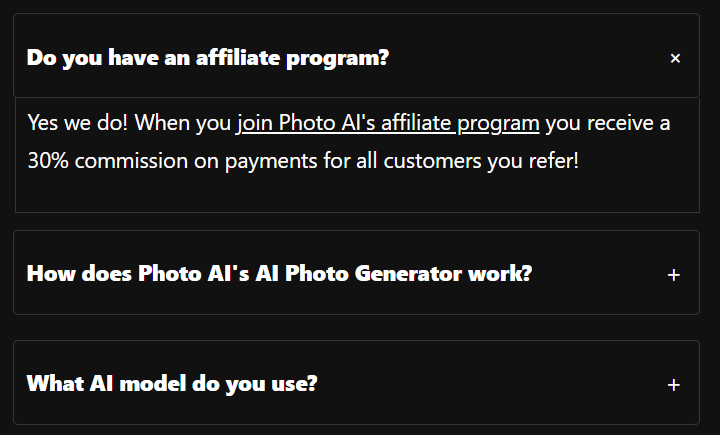
Add borders so that they become sections.
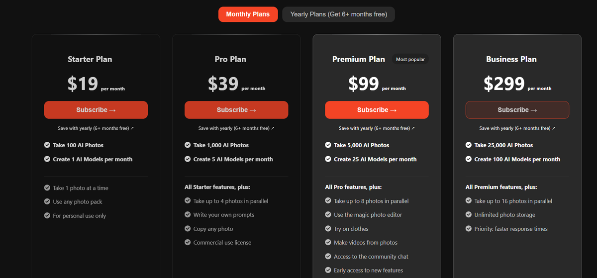
Overall, the pricing page looks good and it is very clear what you get. But there are some improvements that can be made.
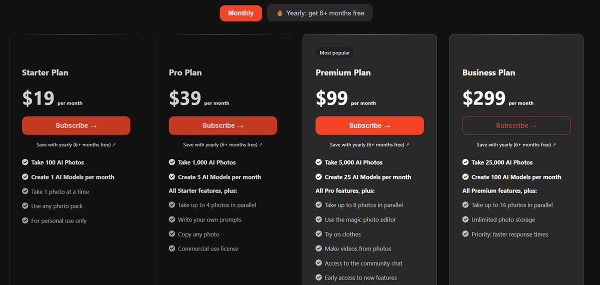
Overall, a good pricing table.
Centered the pricing header
Moved the (most popular) badge to save space.
Separated the first 2 features from the overall features using a simple HR line.
Hover Subscribe button: added shadow so it is more visible.
Improved the text of the Monthly/Yearly buttons.
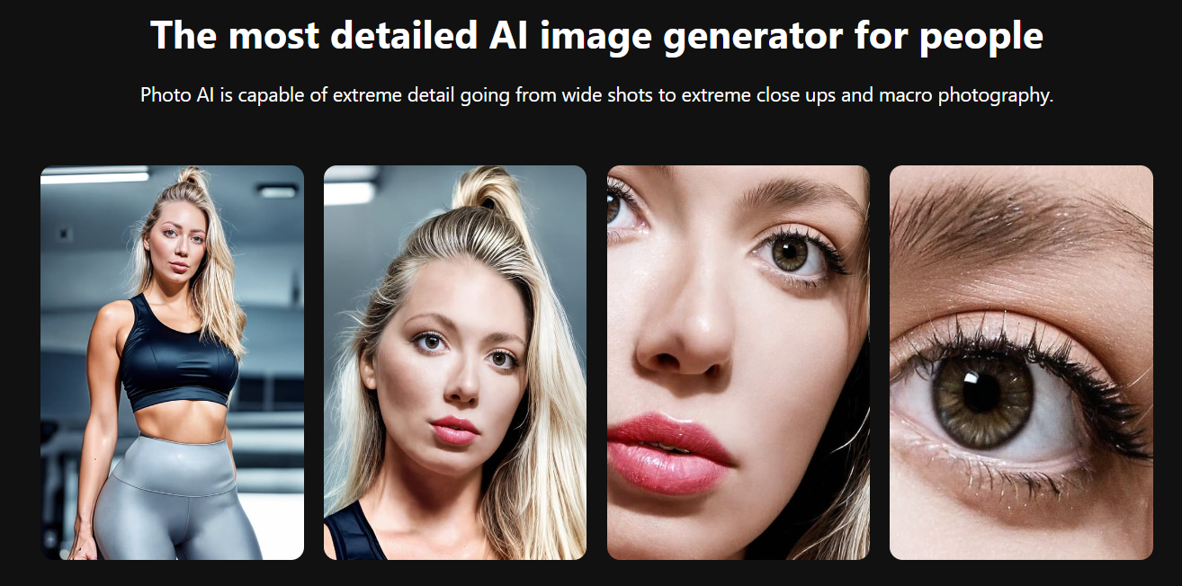
PhotoAI's core product - the AI photo enhancement tool - has shown impressive capabilities, but it also has some room for improvement. Let's dive into a before and after comparison of the product's performance.
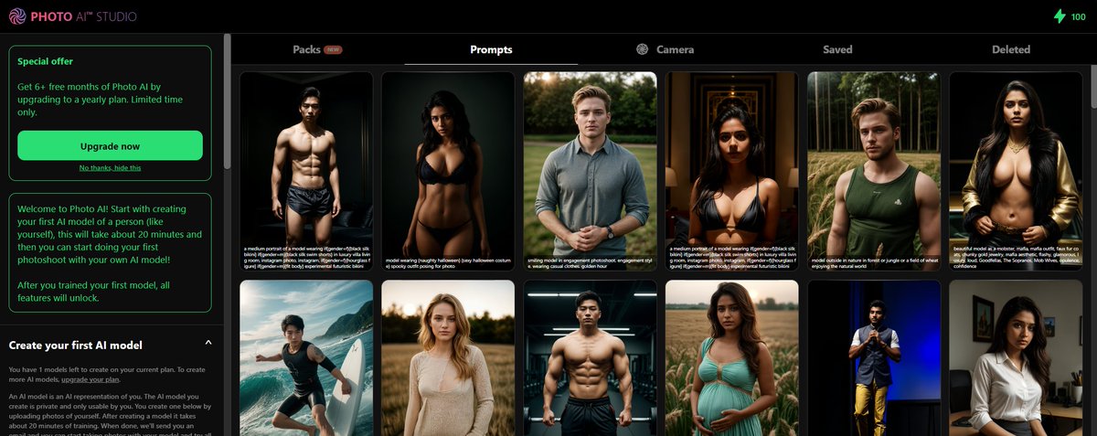
When you log in, you need to create your first model via the sidebar.
I see a Special Offer without even testing the product, maybe it would be better to show this later or just once..

Better to make creating your first AI model more central, and use the demo results as background.
While testing PhotoAI, several bugs and areas for improvement were identified. Addressing these issues will be crucial for enhancing the overall user experience and stability of the platform.
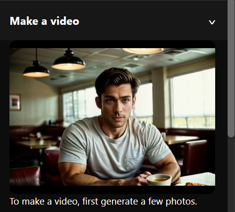
Like other sections, you cannot collapse the make a video section.
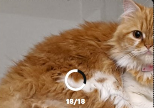
While this is somewhat true (my cat is 2 years old), it still needs to distinguish between a human and an animal.
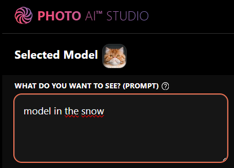
When scrolling, you can easily forget what model you are using. If you make it sticky, they can always see what model they are using.
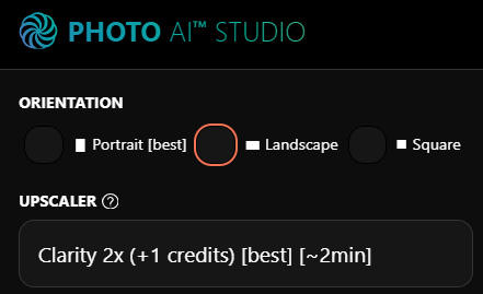
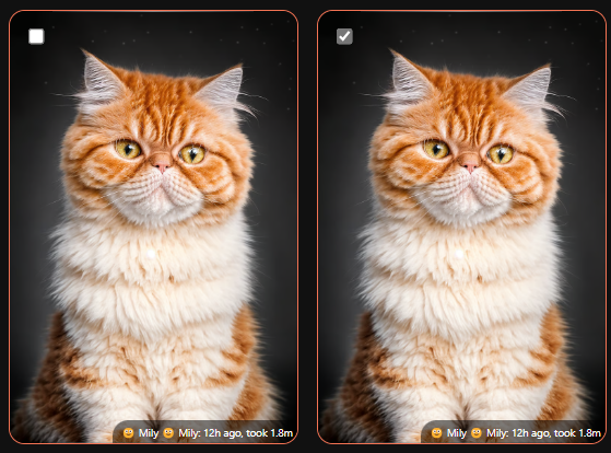
There are many dropdowns, for a better user experience I would recommend using multi-select.
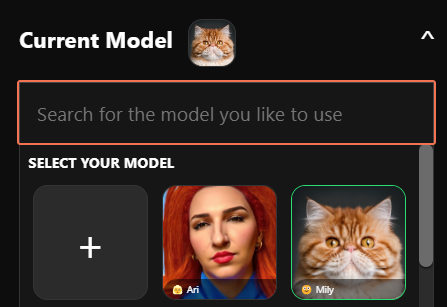
Make it easy for users to search for the model they like to use, instead of using the dropdown.
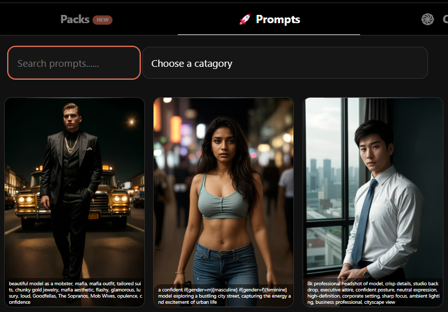
There are many prompts but it is hard to find what you are looking for. Add categories and search to make it easier.
While PhotoAI is a powerful tool, there are still some features that could be added to enhance the user experience. Here are some ideas for future improvements:
Bulk actions allow users to select multiple images at once, such as deleting or downloading multiple photos. This feature can be useful for managing large collections of images.
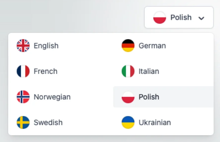
To give users a more personal experience, it can be a good idea to add more languages.
When you are logged in, there is no page or display name to see which account you are logged in with.